2025 Paint Color of the Year: The hottest trends from the top brands featuring the major paint companies and their standout colors.
The paint industry has spoken, and 2025 Color of the Year is all about bold, transformative hues that reflect individuality, nature, and innovation. From calming neutrals to vibrant statement shades, here’s a roundup of the Paint Colors of the Year. Along with inspiration for how to use them in your home.
1. Sherwin-Williams: Ethereal White
Color Code: SW 6182
Description: A soft, airy grey with a hint of lavender. Ethereal White is the perfect balance of tranquility and sophistication. This versatile shade works beautifully in living rooms, bedrooms, or as an accent wall in modern spaces.
Inspiration: Pair it with crisp white trim and natural wood accents for a serene, contemporary vibe.
Window Treatment: Base White Composite Shutters, Textured Coconut Faux-wood matching your crisp white trim, or go with Natural Woven Shades to connect with your wood accents.
2. Benjamin Moore: Cinnamon Slate
Color Code: B2113-40
Description: A delicate mix of heathered plum and velvety brown, this nuanced color brings a smooth familiarity to any design. It’s ideal for creating cozy, inviting spaces like dining rooms or home offices.
Inspiration: This palette of foundational colors transitions gracefully from room to room. Paired together in a room or throughout the whole home, these thoughtful hues exude warmth, comfort, and a sense of ease.
Window Treatment: Layering Soft Treatments — Drapery or Roman Shades that you can layer. Looking at white/ off-white under layer with taupe outer layer. This will bring even more feeling of warmth, comfort and sense of ease.
3. Behr: Rumors
Color Code: MQ1-15
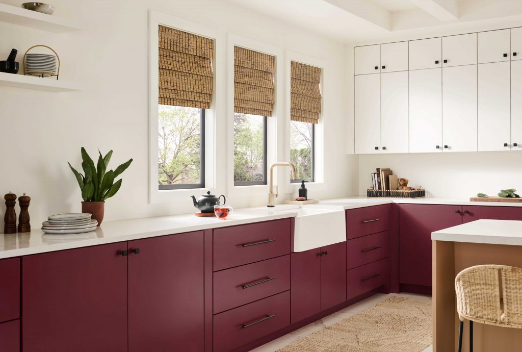
Description: Add Warmth And Rich Allure With This Deep, moody Ruby Red. Luxurious ruby red adding warmth and rich allure. Use it in spaces where you want to add depth and character, like a home library or accent wall. Also, used in living rooms, dining rooms, and for ceilings.
Inspiration: Pair it with metallic gold or brass accents for a luxurious, modern feel.
Window Treatments: Natural Woven Shades or Natural Drapery crafted from organic, renewable resources like bamboo, jute, and grasses. These window treatments bring a unique textural element and breathtaking natural beauty to your home.
4. PPG: Purple Basil
Color Code: PPG1046-7
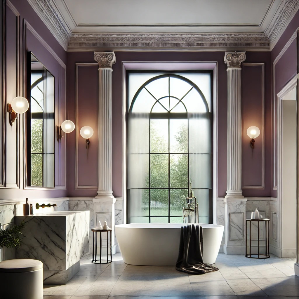
Description: A dusty violet with mauve undertones, Purple Basil reflects the movement away from lighter, airier hues in favor of deeper, richer colors, a trend evident in everything from fashion to interior design. It’s perfect for creating a calming, feminine atmosphere in bedrooms or bathrooms.
This captivating hue is a blend of warmth and energy, inviting you to embrace the transformative power of color in your space.
Inspiration: Combine it with creamy whites and light grey furniture for a chic, minimalist look.
Window Treatments: Minimalist window treatment designs emphasize simplicity and practicality without being too flashy. They usually come with simple designs and neutral colors that allow light to enter without causing any clutter. Common choices include panel track blinds, bamboo shades, or linen curtains – all of which create a calm and open atmosphere for you and your home’s overall style.
5. Farrow & Ball: Yeabridge Green
Color Code: No. 287
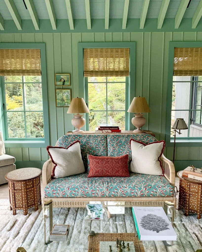
Description: A lush, earthy green that brings the outdoors in. Yeabridge Green (Farrow & Ball Color of the Year) is ideal for creating a connection to nature. Use it in kitchens, living rooms, or even on cabinetry for a bold, organic feel.
This fresh avocado green was discovered in an 18th century Georgian farmhouse in Yeabridge, Somerset, when the original gun cupboard was removed. This uncomplicated, clean green sits happily in both contemporary settings and period homes. Pair with Hague or Dix Blue to create a truly uplifting interior.
Inspiration: Pair it with natural textures like rattan, jute, and stone for a harmonious, grounded aesthetic.
Window Treatments: Natural Woven Shades or Natural Drapery crafted from organic, renewable resources like bamboo, jute, and grasses. These window treatments bring a unique textural element and breathtaking natural beauty to your home.
6. Valspar: Epic Adventure, Blue Olympus or Encore
Color Code: Epic Adventure V073-6, Blue Olympus 109G, Encore 8002-45G
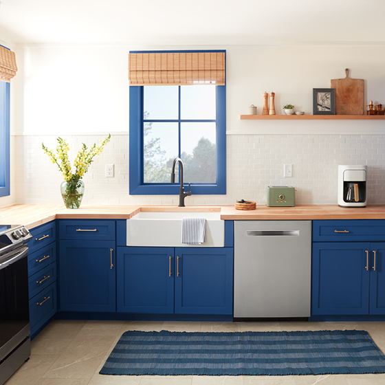
Description: Blue is enjoying its comeback — its encore, if you will. Valspar® Color of the Year Encore is an anchoring shade that embodies constancy and confidence to let you create a joyful respite from the ebbs and flows of life.
Inspiration: Combine it with neutral tones like beige or grey to let this bold shade shine.
Window Treatments: Natural Woven Shades or Natural Drapery crafted from organic, renewable resources like bamboo, jute, and grasses. These window treatments bring a unique textural element and breathtaking natural beauty to your home.
7. Dunn-Edwards: Caramelized
Color Code: DET687
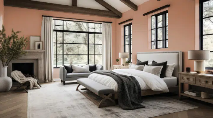
Description: Caramelized (Dunn-Edward’s Color of the Year) is a warm terracotta brown with soft, earthy tones reminiscent of sunbaked clay. The ultimate new neutral, this sophisticated color demonstrates versatility, pairing well with various styles, from vintage-inspired interiors to sleek, contemporary spaces that embrace the concept of ‘old is new.’
Revamp your neutral scheme with Caramelized, a more vibrant hue, stepping away from the typical off-white, white, or greige.
Inspiration: Pair it with soft, velvety textures and gold accents for a regal, elegant look.
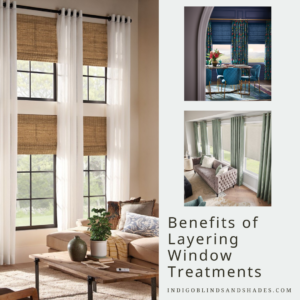
Window Treatments: Layering window treatments is a stylish and practical way to enhance the look and function of your windows. When you combine two or more types of treatments – like curtains, blinds, shades, or valances – you create a more dynamic and polished effect for your space. This approach allows you to customize different levels of light control, privacy, and insulation while adding depth and texture to your decor.
8. Pantone: Mocha Mousse
Color Code: 17-1230
Description: Mocha Mousse, a warming, brown hue imbued with richness. It nurtures us with its suggestion of the delectable qualities of chocolate and coffee, answering our desire for comfort. We look to a mellow brown hue whose inherent richness and sensorial and comforting warmth extends further into our desire for comfort, and the indulgence of simple pleasures that we can gift and share with others.
Inspiration: Mocha Mousse (Pantone’s Color of the Year) can stand alone or serve as a versatile foundation, enhancing a wide range of palettes and applications—from minimalist to richly detailed designs—across all color-focused industries. Indulge in what makes you happy
Empowers you to embrace refined tranquility and indulge in what makes you happy through fabrics that are both aspirational and accessible.
Window Treatments:
How to Choose Your 2025 Paint Color of the Year
With so many stunning options for Color of the Year, how do you pick the perfect shade for your home?
Here are a few tips:
- Consider the Mood: Do you want a calming retreat or a vibrant, energetic space?
- Test It Out: Always sample colors on your walls and observe them at different times of the day.
- Think Long-Term: Choose a color that you’ll love for years to come, not just because it’s trendy.
2025 is all about embracing color in bold and unexpected ways. Whether you’re drawn to the calming Ethereal White by Sherwin-Williams or the dramatic Rumors by Behr, there’s a shade for every style and space.